
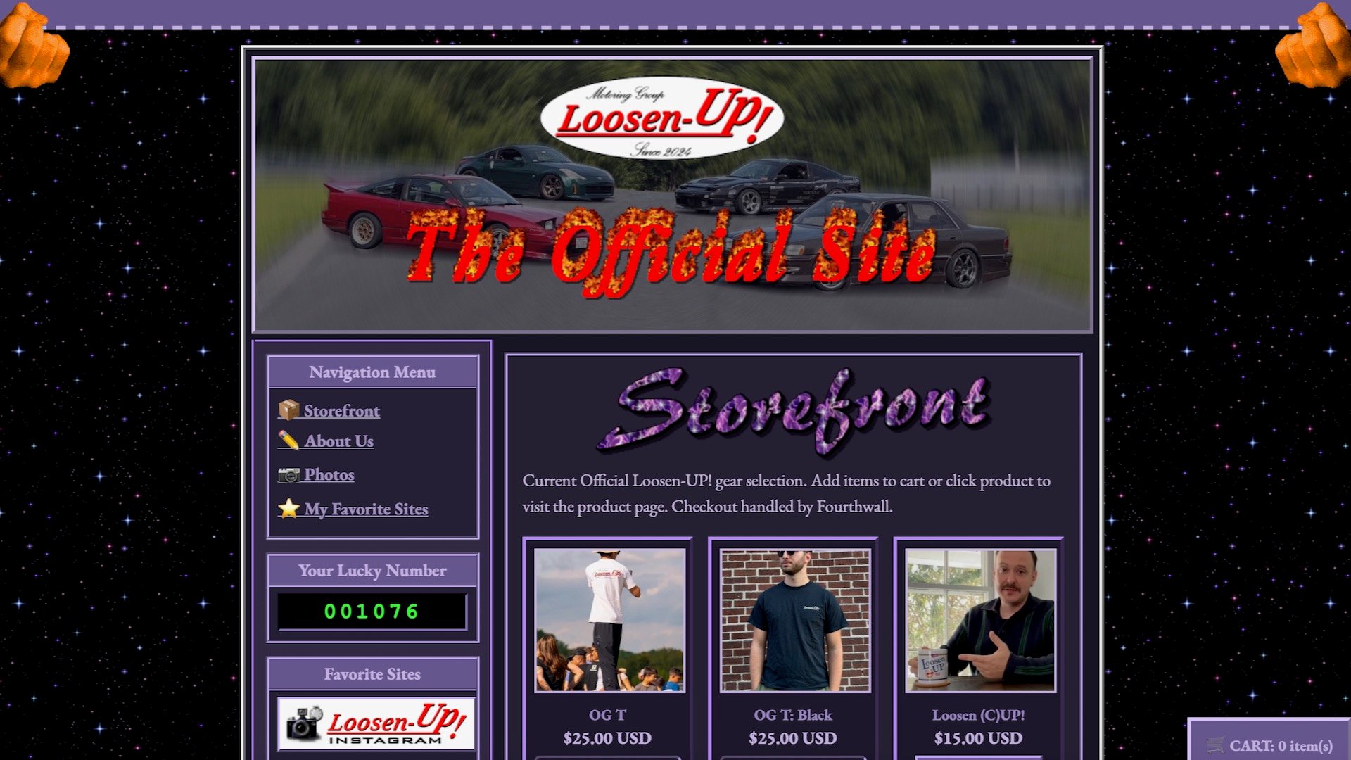


A Boston drift crew called Loosen UP! just launched a merch site at www.s13.world, and it looks like it was built in 1998 using a copy of “HTML for Dummies.” That is entirely the point.
The page greets visitors with a banner reading “best viewed in 800×600.” There are cheesy animations, flaming text, a visitor counter, and a links section labeled “favorite sites.” Every image in the photo gallery is deliberately tiny.
The whole thing sits on a twinkling night-sky background in multiple shades of purple, as if someone raided the GeoCities template library and said, “Yeah, all of them.” It is, without question, the most fun automotive website currently online.
The team runs drift-era staples: an S13 Nissan 240SX, an MX83 Toyota Cressida, and a Z33 Nissan 350Z. These are the same cars that populated American drift events when websites actually looked like this, making the whole exercise period-correct down to the pixel. It’s the digital equivalent of showing up to Radwood in a Member’s Only jacket.
What makes the site land so well is the contrast with everything else on the internet right now. The modern web has been scrubbed clean by algorithms, cookie consent banners, and the relentless sameness of Squarespace templates. Every car brand, tuner shop, and race team runs the same white background, sans-serif font, full-width hero image layout. It works, but it has zero personality.
Loosen UP! went the opposite direction. No drop-down menus. No pop-ups begging for newsletter signups before you’ve read a single word. No Instagram embed grids. Just garish colors, absurd animations, and a commitment to the bit that borders on performance art.
The site doubles as a merch store, which is clever packaging. You come for the nostalgia trip, you leave with a t-shirt. It’s marketing that doesn’t feel like marketing, because it’s too busy being entertaining.
There’s a reason early web design still triggers something in people who lived through it. Those sites were handmade. They reflected individual taste, even when that taste was objectively terrible.
The internet in 1999 was a place where a 15-year-old kid could teach himself HTML and build a shrine to his favorite car, complete with a MIDI soundtrack and an “Under Construction” GIF. Nobody optimized for SEO. Nobody A/B tested button colors.
The Loosen UP! crew clearly understands this. Their cars are analog-era machines built for sliding sideways, not for setting lap records or impressing algorithms. The website matches.
Full disclosure applies here: The Drive’s own Aaron Segal is a member of the team, so take that for whatever it’s worth. But the site speaks for itself. It’s a reminder that the web used to reward weirdness, and that somewhere between Web 2.0 and the current wasteland of algorithmically generated slop, we traded personality for efficiency.
Drifting itself has always been the motorsport that refused to take itself too seriously. S-chassis cars held together with zip ties and optimism, driven by people who valued style over speed. A website that looks like a Netscape fever dream fits that ethos better than any polished WordPress theme ever could.
The visitor counter keeps climbing.


Share this Story