

“You will never find a red Cupra.” That’s not a prediction — it’s a decree, handed down by Cupra creative director Francesca Sangalli with the kind of certainty usually reserved for papal bulls.
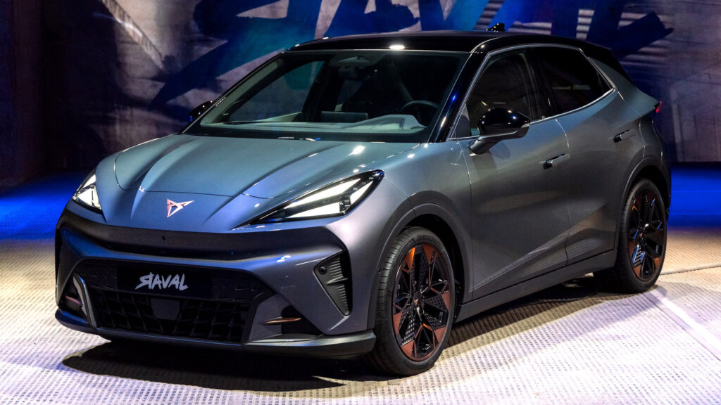
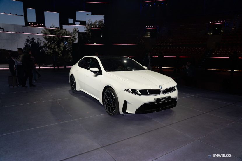
The Spanish performance brand, born from Seat and backed by the Volkswagen Group, has committed to a permanent greyscale palette across its entire lineup. No red. No yellow. No blue. Not now, not ever, according to Sangalli. The new Raval, Cupra’s critical electric supermini, arrives with seven color options: white, black, copper, matt grey, matt black, a greyish pearl, and matt green. If that sounds like browsing a kitchen appliance catalog, you’re not alone.
Sangalli frames this as discipline, not limitation. “We took a strategic decision to make design the pillar of Cupra,” she told Autocar. “We said Cupra is raw.” The brand’s identity, she argues, lives in texture — matt finishes, what she calls an “oily treatment of colour” — rather than spectrum. Bright hues belong to Ferrari and Lamborghini. Cupra plays a different game.
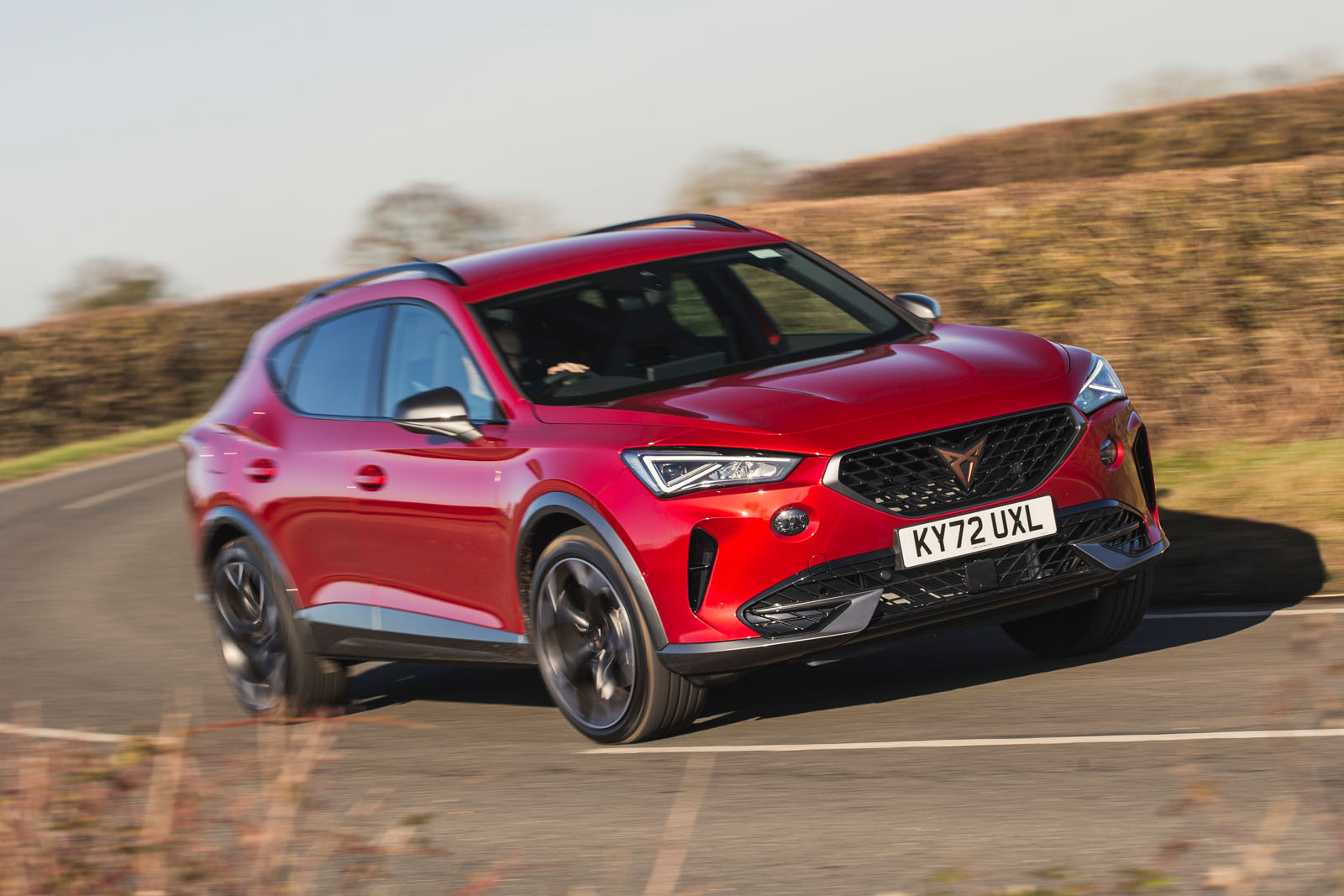
It’s a gutsy gambit for a brand that previously offered its Formentor and Leon in shades like Desire Red and Petrol Blue. Those days are over. The palette purge is complete, and Sangalli is unapologetic. “You choose a Cupra if you like the brand, and you choose the range of colours that fits with the brand and not vice versa.”
That logic works brilliantly when you’re Porsche, where buyers will happily pay $12,000 for Paint to Sample in Rubystone Red. It works when you’re Apple, where consumers line up for the same silver rectangle year after year. It requires a level of brand devotion that Cupra — five years old, still unknown in many markets, and yet to post standalone financial results — has not yet earned.
The timing is particularly curious. Cupra is launching the Raval as its first truly mass-market electric vehicle, priced to compete with the Renault 5 and Fiat Grande Panda. These are segments where personality sells. The Renault 5 comes in a bright pop-art yellow. The Fiat leans hard into retro greens and blues. Cupra’s response is seven shades of restraint aimed at a target demographic the brand says averages 34 years old.
Sangalli invoked Ferrari by name, essentially conceding the emotional territory of color to brands with decades of heritage behind their reds and yellows. The comparison flatters Cupra — nobody cross-shops a €25,000 electric supermini with a €300,000 supercar — but it reveals the ambition. Cupra wants to be perceived as a design brand first, a car company second.
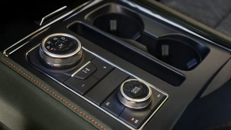
The reader comments beneath the Autocar story tell a different tale. Not a single one endorsed the strategy. One longtime Cupra owner who’d bought five of the brand’s cars said he’d already walked away over the shift to touchscreen-heavy interiors. No colors, no buttons, no sale. Another commenter called the matt finishes “unfinished awaiting a top coat.”
One astute observer cut through the marketing fog entirely: comparing your color strategy to Ferrari’s is just positioning — an attempt to borrow prestige by proximity. Most buyers choose monochrome anyway, so the practical impact is minimal. The brand signal is the real product.
That’s exactly right. Cupra isn’t really talking about paint. It’s talking about identity, about convincing buyers that a Volkswagen Group supermini built on the MEB Entry platform carries the same design conviction as a handmade Italian exotic. Whether customers buy the philosophy along with the car — especially when the competition is splashing showrooms with color — is the €25,000 question.
Share this Story